

Digital
Product
Designer.
Hello! I am Faris Ferdian Akbar
Product Designer,
UI/UX Designer,
Mentor UI/UX Designer


I'am Indonesia-based, currently leading the project at Bank Indonesia, with a mission to help users access a lot of data in one portal.
Bank Indonesia
The journey of creating a data portal for Bank Indonesia.
Lion Parcel
Research process & user interface iteration on the Lion Parcel homepage revamp project.
Nurfish Store
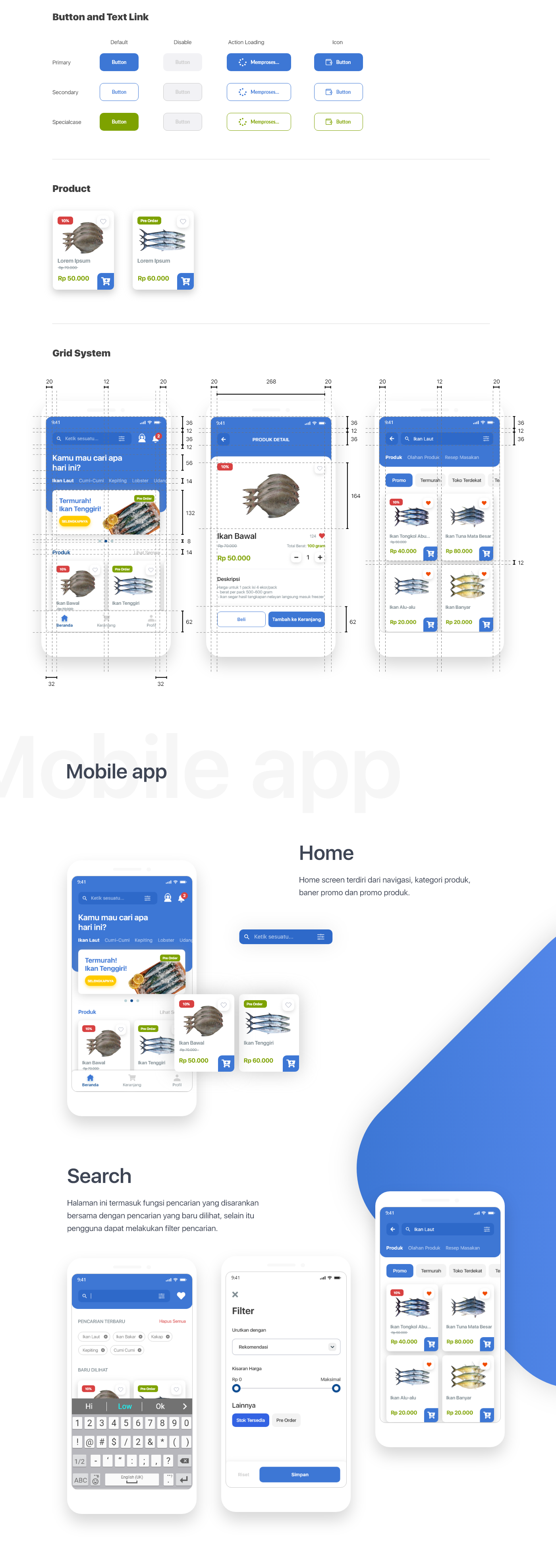
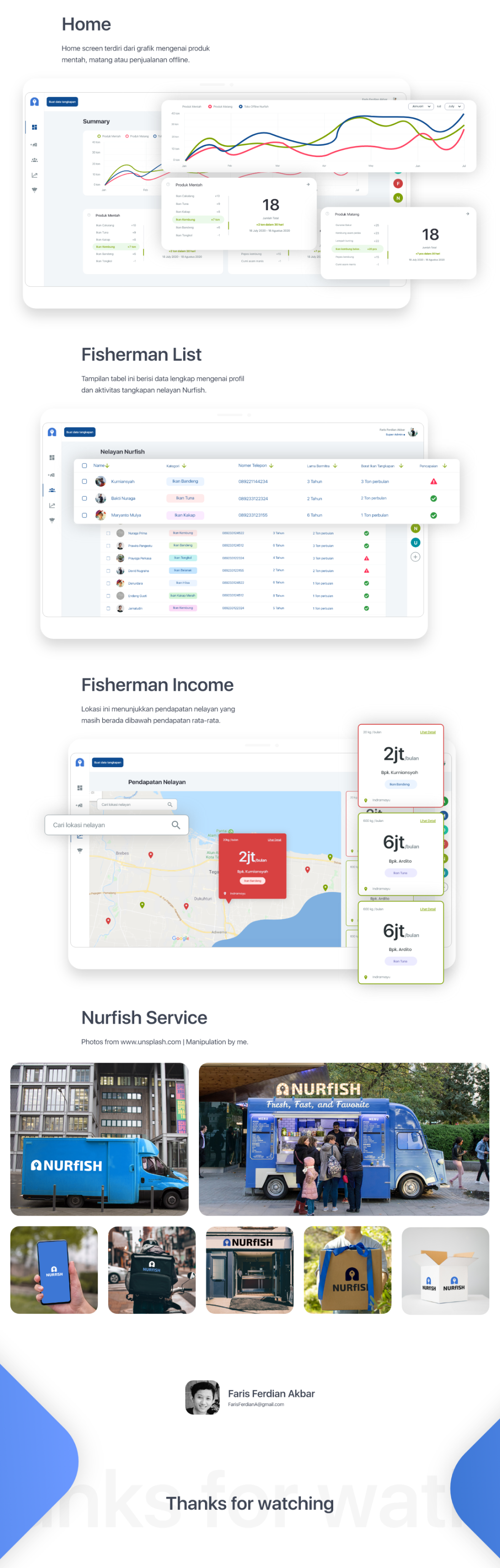
This is my case study when completing my studies at IKJ.
Product
Customer Apps
Date Start
16 Feb 2024
Role
Product Designer
Date End
27 Feb 2024
Since ancient times, humans have been fascinated by technological advances that can overcome logistical challenges and speed up the distribution process. At Lion Parcel, I have the opportunity to develop solutions that help us optimize supply chains, make goods distribution more efficient, and reduce barriers that exist in the world of logistics.
The magic of super fiture.
Lion parcel application has features that can always help people. Like favorite agents, then other features such as request pickup, check rates, insurance claims, shopping with points and various types of users who need to solve delivery problems.

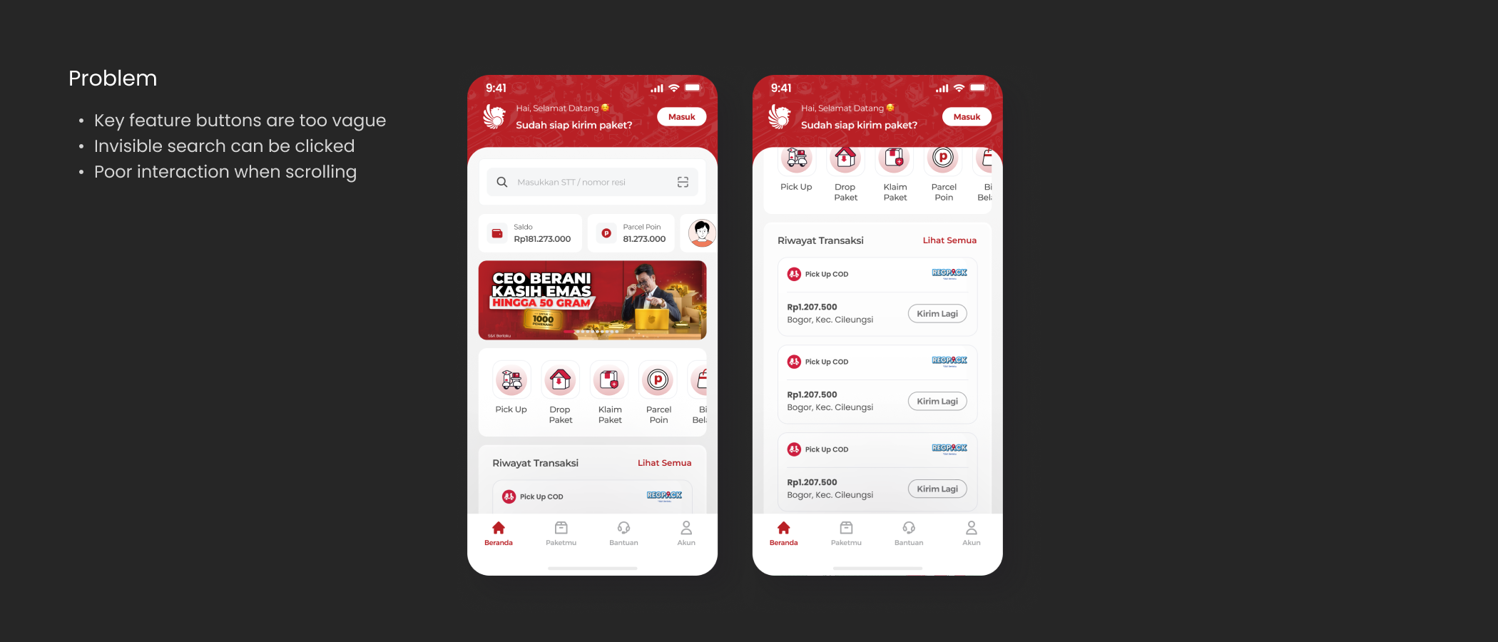
The problem
Unfortunately, many of our users are not aware of these features. In addition, we have more feedback too if the homepage design structure does not suit the user's needs well at the moment.

The deep feeling
We try to collect all the hunches we have and conduct user interviews to validate them directly with the user. By confirming directly with users, the results showed that almost 45% of our users did not know about these features and 90% of users indicated that they only used the pickup, drop package, rate check and package claim features.

First try
While we first experimented with more modern visual elements to improve the interface, we were pleased to receive very positive feedback from users, indicating that the changes made their experience more engaging and easier to understand. However, there was something surprising for us, almost more than 80% of our participants expected fresher changes to all layouts and components, not just part of it. So what happened? we started to iterate the layout and design.

Back to canvas
Therefore, we decided to go back to square one and reflect, what simple changes could we apply to a UI that is already familiar to users, to make the existing features more easily recognized? We experimented with redesigning icons, adding text to labels, and separating features more clearly: pickup, package drop, rate check, and package claim.

Everything that happens.
We didn't stop there. At Lion Parcel, we are always thinking about ways to improve the product experience for our users. We create UI when order status is in progress, there are parcel point discounts and rate checks. We thought of these situations to illustrate how situations often occur in some of the design and style options that we have created.

After we evaluated several existing design options, we finally selected the one we thought had the most potential and proceeded with further testing. However, in the process, we encountered some quite significant problems. One of them is the user's difficulty in tracking receipts and finding the desired features more easily, because limited finger reach makes some UI elements difficult to reach comfortably.
Apart from that, we also received feedback that users felt uncomfortable when scrolling up, because the navigation bar, which should not be the main element, appeared dominant, which interfered with their navigation experience.
Proposed changes
After learning valuable lessons from improving user discoverability through simple changes we had implemented previously, we started asking ourselves: what simple changes could we make to the user interface (UI) to make the experience more intuitive and easy to understand, without sacrificing functionality or comfort for users already accustomed to the existing design?
We designed a more prominent and easy-to-find search field by working with the graphic design team to establish color rules that were not only visually appealing but also made it easier for users to navigate the interface. In addition, we also added a touch of more eye-catching color to certain service feature, while thinking about the user's experience when they scroll up, with the aim of keeping the appearance consistent and intuitive without disrupting the flow of their interactions.

Results
After releasing a product update with a more intuitive and functional interface design, we saw significant results. Usage of key features increased by 30%.

In addition, user satisfaction levels measured through direct surveys show a 20% increase in comfort and ease of navigation. We also noted a 15% decrease in the bounce rate, indicating that the new design is more effective at capturing users' attention and keeping them engaged with the app for longer.
Thanks for reading!
.


Ease of Data Access
in just one Omni Data
Product
Portal Data Web Dekstop
Date Start
01 June 2024
Role
User research, visual, and interaction design.
Date End
30 Nov 2024
I work at Bank Indonesia in a role to help users, both internal and external, in managing and utilizing big data in government systems. My main tasks involve developing and implementing technological solutions that enable the effective processing of large amounts of data, so that the resulting information can be used for better and faster decision making.
Business
Problem: The Silos.
Bank Indonesia currently has several data portals that are used internally by Bank Indonesia employees such as SIMP, BI-SSS, HARTIS, PAPEDA, EDW ASBI, and INDRA PORTAL (FEDM).
Portal data is built based on the needs of each department so that management becomes a silo.
User Problem: The Single of Truth
With the needs of Bank Indonesia employees for data continuing to grow, this has led to the need to update the internal data portal which can accommodate the problems and needs of all departments.
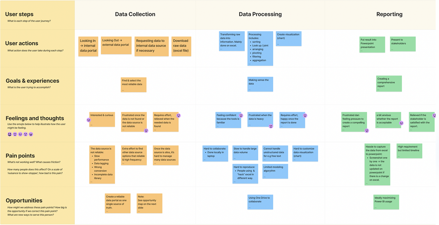
Based on qualitative research, we found several negative impacts:
- Currently data sources are spread across each department where there are data inconsistencies.
- It is difficult to access data because of the lack of data owner information and the process is too long to request data.
- There are data sources that overlap between data portal platforms currently, causing confusion in making data requests.
- Granular data is available via SQL queries while users need a more user friendly mechanism.

Project Goal:
Stop the silos & make omni-data intellegence.
How do we create a data portal so that there are no silos and provide an omni-data intelligence platform (OIP) that supports data as a service so that it can be obtained easily by both internal and external parties.

Project Timeline
& Process
We go through a series of verification processes to ensure
that we are addressing issues appropriately.

Concept Model
This phase focuses on identifying the roles of users involved in the system, as well as understanding how the system functions and interacts with different user types to achieve the desired outcomes.

Concept & Wireframing
The concept of the data portal defines its purpose, target audience, and key features, while the wireframe outlines the layout and structure of the interface to guide development and user navigation.

Add data
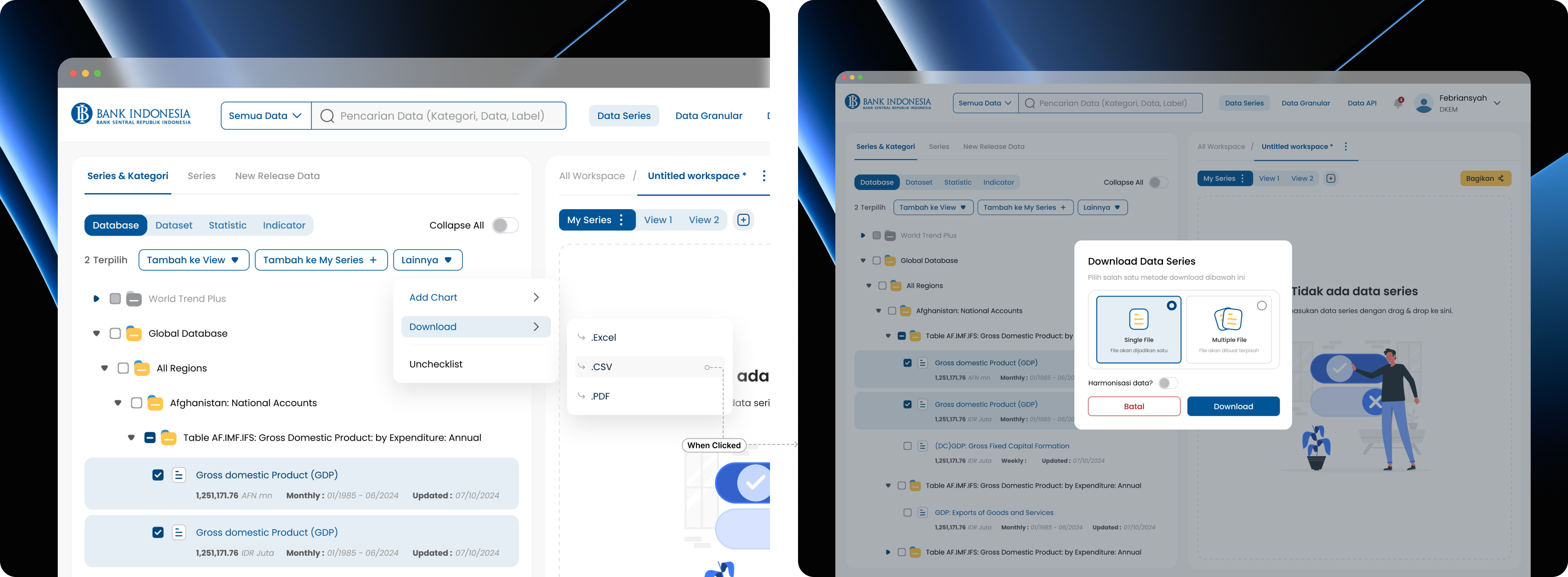
Admin has a feature to add data. This means that the user's goal is to add data, be it series, granular or API data. How can we help users add data while making it easy to do?

Setting Data Access
Admin also has data access features. This means that the user's goal is to regulate which users can access each data. This data access is given at the individual or group/department level.

Collecting data series
Employee users have a drag & drop feature to collect data series. This means that the user's goal is to collect all data series in one workspace.
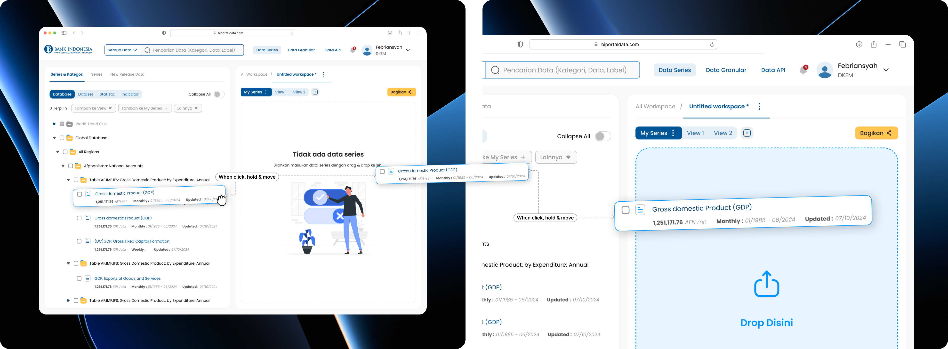
Download data series
Employee users have a data download feature. This means that users can download one or multiple data at once. However, if the user downloads multiple data at once, the user can choose to download with single or multiple results.
Validation of admin and internal users
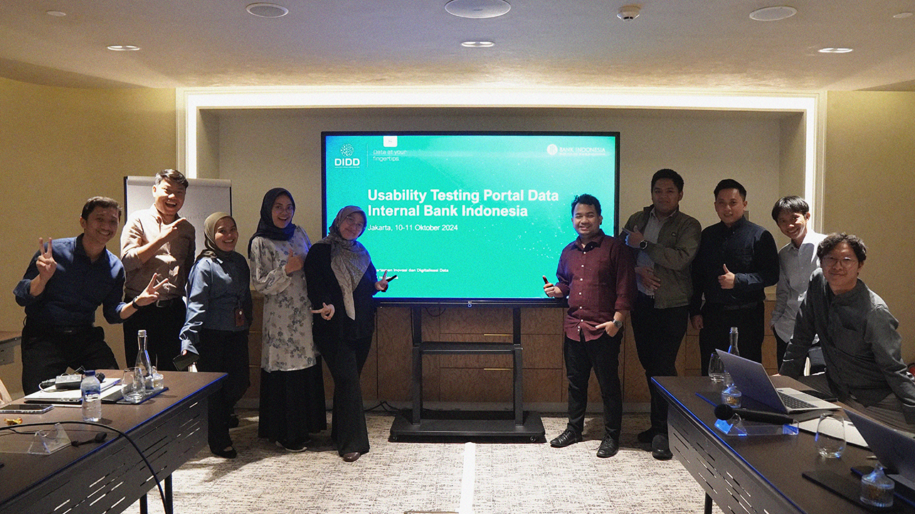
To validate the design that has been created, we carried out usability testing with 5 admin users and 11 employee users. This test is carried out directly while recording the screen and face as a strong form of documentation for follow-up.

The proposed design successfully meets
the main objectives of
the project
In admin features:
- ✅ Perform user management: users can understand how to add, change and delete employee lists easily. Perform user management: users can understand how to add, change and delete employee lists easily.
- ✅ Add data series, granular or API: the majority of users can understand that they can add data easily. The information displayed is very helpful to users.
- ✅ Implementing data access rights: the design and layout of access rights can be easily understood by users. They understand how to set access rights at the employee or group level.
On employee features:
- ✅ Downloading data: from the design concept offered, users can easily find a way to download the data presented.
- ✅ Viewing data in chart form: users can easily convert data into chart view form.
- ✅ Requesting data: the majority of users know the difference between data that can be accessed and what cannot. Users can also do this easily when processing data requests.
From several positive results, our usability testing is also not without suggestions and insights. Then, I held several discussions with the team to discuss all suggestions and insights in the form of an effort impact matrix and selected several inputs to be implemented into the design.

The process of incorporating feedback into effort metrics involves evaluating the input to measure both the effort required for implementation and the potential impact, enabling a comprehensive assessment of the changes' effectiveness and resource demands.

Iteration & Launch
When we have iterated. We launching and testing the website in an isolated network environment at Bank Indonesia. The goal is to ensure the website functions well, is safe, and meets user needs before it is officially launched. Especially the data access feature.

Result: In this launch, internal employees can access the required data, which has attracted the interest of more than 300 active users at this time.
This launch aims to attract more users to switch to the data portal, reduce errors and reduce information silos.

Lessons Learned
This is the first launch of our data solution product at Bank Indonesia, so there are still several features that have not been fully covered or optimized.
However, we are committed to continuing to evaluate and improve this product to make it better in the future. We understand that our users' needs are our top priority, and we will continue to focus on meeting their expectations with better and more complete solutions.
Thank you!
.
My Mission
My mission is to help many people through the convenience of the products they use with ensure good experience and ensure to be able to drive business needs.
Creating
impactful projects
Product
Designer
Research, sketching, wireframing, lo-fi design, hi-fi design, and user testing with Figma, Invision, Maze, Etc.

Video & Graphic
design
I use Adobe After Effect, Premier, Audition to edit Video. Also Adobe Photoshop, Illustrator and Blender to create illustrations and 3D renders.

Brand
identity
I help my clients to develop a personality and brand voice, design the brand look and logo.

Frontend
development
I work with HTML/CSS, Framer and WordPress.

The digital
journey
My education
Jul 2016
- Jul 2020
Institut Kesenian Jakarta (IKJ)
Cikini, Jakarta Pusat
I graduated from IKJ with a degree in Visual Communication Design, specializing in Multimedia. My final project focused on UI/UX Design, tackling the challenges of fish pricing and the dynamics between fishermen and middlemen, demonstrating my commitment to creating meaningful digital solutions.
Jan 2020
- Mar 2020
Dunia Dalam Desain Class
Menteng, Jakarta Pusat
Intensive UI/X courses that present the fundamental principles of UI/X Design with research, design, prototype effective, also visually-driven.
Work experience
Jun 2024
- Nov 2024
Bank Indonesia
as a Senior Product Designer (project based)
- Leading & Managed the project using the design sprint framework to ensure efficiency and quality delivery under 6 months.
- Initiated a project that helped internal employees to access data that generated 300+ user interest.
- Conducted user experience research with a focus group of 11 to iterate on early design concept, and generated 80% NPS.
- Designed a portal data admin, internal & external user flow under 6 months for a responsive website using Figma through sketching, wireframing, prototyping & user testing.
Apr 2024
- Jun 2024
Dibimbing
as a Part time UI/X Training & Mentoring
- I was one of the mentors who helped and trained 80 high school to college level participants in preparation for taking part in the Samsung Solve for Tomorrow 2024 competition.
- With an approach that focuses on developing creative and innovative skills, I have increased the success rate of participants to 75% in reaching the final round of the competition.
- With an effective and applicable approach, our team succeeded in overcoming various problems raised as competition themes, with a success rate reaching 85%.
Jul 2022
- Mar 2024
Lion Parcel
as a Product Designer
- Lead the design system and customer application project, overseeing the development and ensuring alignment with user needs and business goals.
- Increased design speed by 20% through establishing an expandable design system in Figma, while working with the product owner and a team of Dev.
- Designed and implemented an intuitive and responsive customer application home page, which increased user retention rates by 30% in the first six months after launch.
- Enabled the startup to monetize with a more than 15% estimated return in Q4 by designing the UI/UX of a habit formation iOS app from conception to delivery through 3+ iterations of wireframing, prototyping, and user testing.
Sep 2021
- Jun 2022
Durianpay Indonesia
as a Product Designer
- Developed and optimized user interface for the payment process, improving user experience and reducing transaction time by up to 25%.
- Working closely with developers and marketing teams to design new features, resulted in increased user satisfaction reflected in positive feedback and a 15% reduction in churn rate
- Conducted in-depth user research to understand customer needs and behavior, which resulted in the development of more targeted design solutions and increased conversions by 20%.
Jul 2020
- Aug 2021
PT TrawlBens Teknologi Anak Indonesia
as a Product Designer
- Designed intuitive user interfaces for logistics platforms, increasing operational efficiency and reducing average delivery times by 30%.
- Conduct user research and competitor analysis to identify market needs, resulting in new features that improve user experience and support customer growth of up to 40%.
- Work closely with development teams and product management to create interactive prototypes, accelerating product development cycles and ensuring successful launches on schedule.
Sep 2019
- Dec 2021
BIT - PT Barito Integra Teknologi
as a Freelance UI/UX Designer
- Designed intuitive interfaces for applications and web platforms of leading clients such as Panin Bank, Prudential, and Kalbe, increasing user satisfaction by up to 35% based on feedback surveys.
- Worked closely with developers, project managers and stakeholders to implement complex design solutions in large projects such as BUMA and Hyundai Healthy App, ensuring on-time and on-spec rollouts.
- Conduct usability testing for all projects, resulting in effective design iterations and increasing application conversion rates by up to 25%, as well as strengthening the client's position in the digital market.
Sep 2019
- Nov 2019
Hacktiv8 Indonesia
as a UI Designer Internship
- Contributed to overhauling the e-learning website design for a learning program, which successfully increased user engagement rates by 30% based on user metrics analysis.
- Conducted user research and usability testing, identified and resolved 15 key pain points, resulting in a more intuitive interface and increased overall user satisfaction.
- Participated in overhauling the installment payment system, which simplified the process for 200+ new users in the first month, and contributed to a 25% increase in transaction conversions.
Jan 2018
- Jul 2018
Goodeva Technology
as a UI Designer Freelance
- Worked on video graphic and motion design projects that succeeded in increasing client engagement on social media, with an average increase in impressions of 40% and higher user interaction.
- Create graphic design materials that support company branding, including marketing materials and presentations, which contribute to increasing brand visibility and product recognition in the market.
- Develop attractive and functional user interfaces for various applications and websites, improving user experience and navigation efficiency as measured by increased user satisfaction.
My favourite tools
Figma
XD
After Effect
Illustrator
Photoshop
HTML5
CSS3
Notion
Concept & Interaction
This is my iteration to collaborate design with interaction. In this case I tried to redesign the Spotify desktop.
Graphic & Design
Besides being a product designer, I am also involved in several areas of graphic design.
Logo & Brand Guideline Graphic Designer
Working as a Logo and Brand Guideline Specialist involves creating and maintaining cohesive visual identities that represent a brand's core values and mission. This includes designing logos, selecting brand colors, typography, and establishing design rules to ensure consistency across all platforms and materials.

Social Media Post Graphic Designer
Working as an social media post involves creating visually appealing and engaging content that aligns with a brand's identity and goals. This includes designing posts, stories, and reels that capture the audience's attention, enhance brand recognition, and drive interaction and growth on social media.

Digital Manipulation Graphic Designer
Practicing digital manipulation during my college years involved experimenting with various techniques to seamlessly blend, alter, and enhance images. This training helped me develop a strong eye for detail, master photo editing software, and create visually compelling compositions that tell a story or convey a specific message.

Social Media Post Graphic Designer
Working as a UI/UX Designer also involves contributing as an Social Media Post Designer, where I create user-centric digital experiences and engaging social media content. This dual role allows me to balance designing intuitive interfaces with producing visually appealing posts that enhance brand presence and user engagement.

Mockup Design Graphic Designer
Working with mockup design involves creating realistic and detailed prototypes that showcase how a product or design will look in real life. This includes developing mockups for websites, apps, and other digital assets to present and test design concepts before final production.

